📰 Is the Auckland FC kit better than the Phoenix?
- Publish date
- Sunday, 17 Mar 2024, 2:33PM
By Will Toogood
New Zealand has another professional football team and with that comes a new name, crest and most importantly playing kit.
A club’s debut kit and crest define who they are as much as the name does; sporting apparel nerds will tell you it is even more important.
Auckland FC settled on New Balance for their manufacturer and provided a blank canvas with which to work with. To say the result has had mixed reviews would be like saying Auckland’s traffic can be a little frustrating.
What the result has done is sown the seeds for a genuine rivalry between the newcomers in the Black Knights and the incumbent professionals the Wellington Phoenix. More accurately, a rivalry between their fans.
The Phoenix didn’t hold back on their thoughts on the new expansion team’s strip on social media, responding to an image of Auckland FC’s fresh kit with a vomit emoji.
🤮
— Wellington Phoenix 🔥 (@WgtnPhoenixFC) March 14, 2024
Numerous ‘Nix supporters with their Kosta Barbarouses profile pictures added their disdain, perhaps looking through pairs of yellow-tinted glasses.
“Looks like it was made on Canva lads” or more a more eloquent “wtf is that” were just some of the comments from TwitterX critics.
That isn’t to say the kit didn’t receive praise: “I’ve wanted royal blue stripes in this league for a decade. Finally. What a kit,” was one social media user’s take.
But as any good journalist will tell you: you can’t believe everything you read on social media. You must think critically and seek out differing opinions. This is where NZME comes in.
A crack team of experts has been assembled to give a definitive assessment on the expansion club’s new kit, crest and how it stacks up against their rival’s.
Crest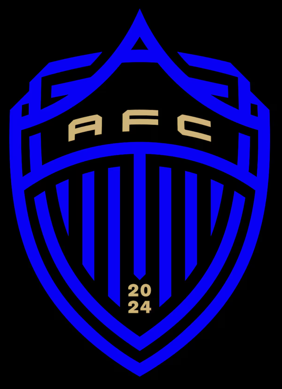
What the club says:
The club’s visual identity represents the city of Auckland throughout, from its primary colour - electric blue - building on Auckland’s traditional royal blue, to the crest. The newly revealed shield contains a graphic tribute to Rangitoto and Auckland’s iconic skyline, and with an ascending “A” for Auckland in its centre. The Black Knight visor and the stripes in the badge link the crest to club founder Bill Foley and the teams that form part of the Black Knight Football Group.
What the Herald says:
Yep, there’s an A alright. Not sure how you get Rangitoto and the skyline in there but I suppose it’s tall and pointy. No doubt they’d have loved to put the Sky Tower on there but Auckland City FC have already claimed that one for themselves. As a badge I do like it, it’s simple and the “AFC” and “2024″ pop nicely against the black. The Black Knight visor is unobtrusive and gives it a real shield vibe.
What the experts say:
“Strong lines and a striking, sporty shade of blue — the same shade Burberry tried to make happen last season in fact. This is a good crest. They’ve kept it simple, so it will be an easy motif to apply to uniforms and the grass on the field, and the stripes are an element that can be translated across the on and off-field uniforms for seasons to come.” — Emma Gleason, NZ Herald lifestyle and entertainment deputy editor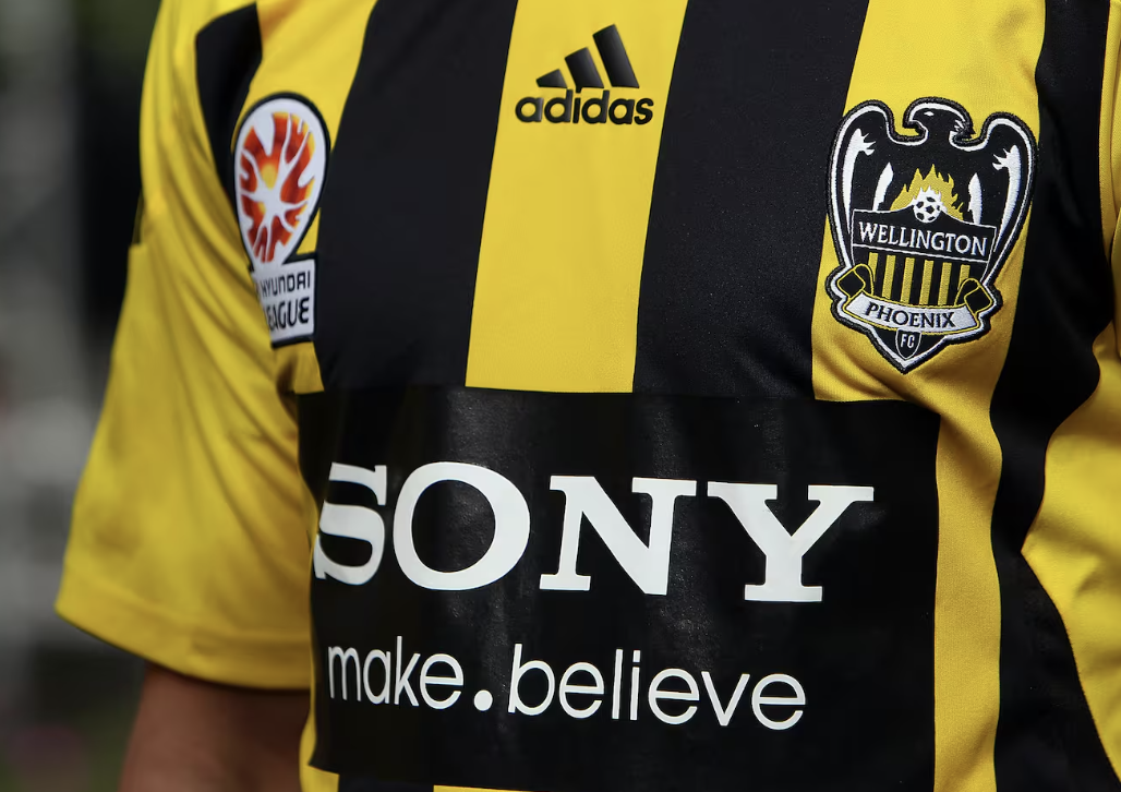
Is it better than the Phoenix? If we are comparing the original Wellington Phoenix to this then no, it’s a certain second. The first Nix badge in 2007 was a beauty. The 2017 reinvention was a bit of a step backward to a uniform circle crest. Still, if you take a completely objective view, there is more imagination in the Phoenix crest than in Auckland FC’s. The Nix inclusion of “E Rere Te Keo” — a call to prepare, which is rooted in Māori pūrākau (legend) of a taniwha that is said to inhabit Wellington harbour — seals the win for the Wellingtonians.
Kit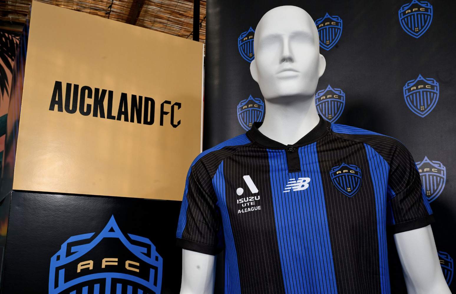
What the club says:
Featuring the club’s electric blue and black and New Balance’s cutting-edge performance technology, the kit went on pre-sale today on the club’s website.
What the Herald says:
Not a great deal was revealed by Auckland FC as to thought process behind the design. Early criticism came that it looks like an Inter Milan kit — which it does — and that should only be taken as praise by the designers. The blue and black stripes accented by the thin pinstripes are a classic look and to have them mirrored in the badge pulls it all together. The collar and button combination adds to the traditional feel and will look great on both fans and players, which is often overlooked.
One area that could be make or break is what happens with the front of shirt sponsor, a blocky logo plastered across the midriff could easily ruin the aesthetic (as it did in the original Phoenix kit of 2007). The badge is absolutely begging for a trim of that gold to really make it stand out against the dark backdrop. As a base for years to come a safe bet was the right call - there will be room for creativity down the line.
What the experts say:
“I agree with Will when he says “you can’t believe everything you read on social media” and the collective sighs on Twitter is a prime example of people loving a good moan. Because the reality is, this is a smart looking kit (I’ve definitely seen worse). The combination of royal blue and black feels powerful and the crest’s ascending ‘A’ is a clever use of space and minimalism. I especially love how the black stripes look on the sleeve, and the repetition of the stripes on the crest looks great.” — Dan Ahwa, Creative and Fashion director at Viva.
“Co-sign on all of the above; it’s smart, classic and not overwrought. It also has a great collar on it; a little bit old school, which I always appreciate.” — Emma Gleason, NZ Herald lifestyle and entertainment deputy editor
Is it better than the Phoenix? With the greatest respect to Paladin (the Wellington Phoenix kit manufacturers) they brought in acclaimed designer Charmaine Love to add what can only be said as a pretty special bit of originality to their 2023/24 kit. Points there, for sure, but (and this is a big but) yellow is a really tough colour to make look good.
It’s why Wallabies jerseys are by and large pretty difficult to look at, it’s why the Hurricanes have the same-looking jersey each year; it’s just not an attractive colour.
Whether or not you think Auckland FC’s kit is better comes down to whether or not you prefer a simple, traditional look or whether you’re after something that represents the city or surroundings of the team. It may also come down to whether you live in Te Whanganui-a-Tara or Tāmaki Makaurau.
Things may change when the Phoenix release their kit for the 2024/25 season, but at this stage the Aucklanders take an early 1-0 lead in the tie.
This article was first published on nzherald.co.nz and is republished here with permission
Take your Radio, Podcasts and Music with you
